Larouche
IQDHO, a renewed source of growth thanks to Larouche
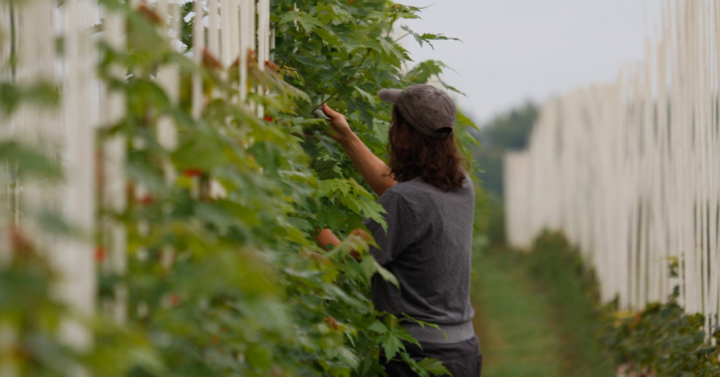
Institut québécois du développement de l’horticulture ornementale (IQDHO) has tapped Larouche Branding and Communications to update its brand. With unique expertise that’s in demand across Quebec, IQDHO provides specialized business development advisory services to horticultural producers in greenhouses, nurseries, sod farms, garden centres, Christmas tree growers and other horticultural stakeholders. IQDHO asked Larouche for a major refresh that would leverage its know-how and commitment to advancing ornamental horticulture in the province. Larouche’s communications plan provided a roadmap for the changes, which included a visual overhaul, updated brand positioning and an all-new website.
Credibility (re)affirmed
“Our team of highly specialized agronomists and our involvement in numerous research projects dedicated to horticultural innovation and sustainable development make IQDHO a preferred partner for producers. One of our main objectives was to find a simple and compelling way to express this DNA by highlighting its unique character, based on a down-to-earth approach to ornamental horticulture,” said Marc André Laplante, IQDHO’s executive director.
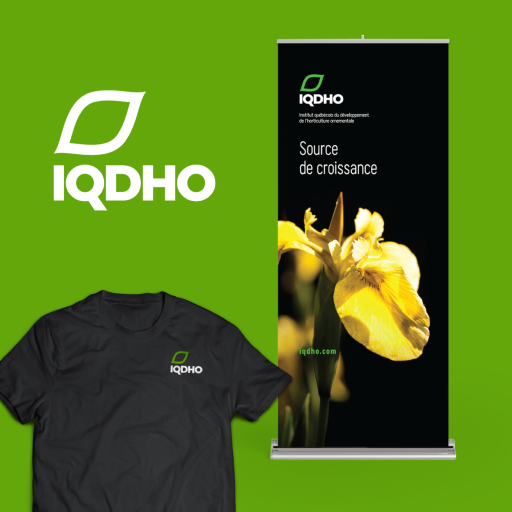
Larouche decided to use the statement Source de croissance as a tool to affirm and reaffirm IQDHO’s credibility. This new positioning statement alone embodies IQDHO’s mission to support the evolution of businesses by sharing its knowledge, promote crop development through its work and spur the growth of the horticultural sector.
New imagery to mark the change
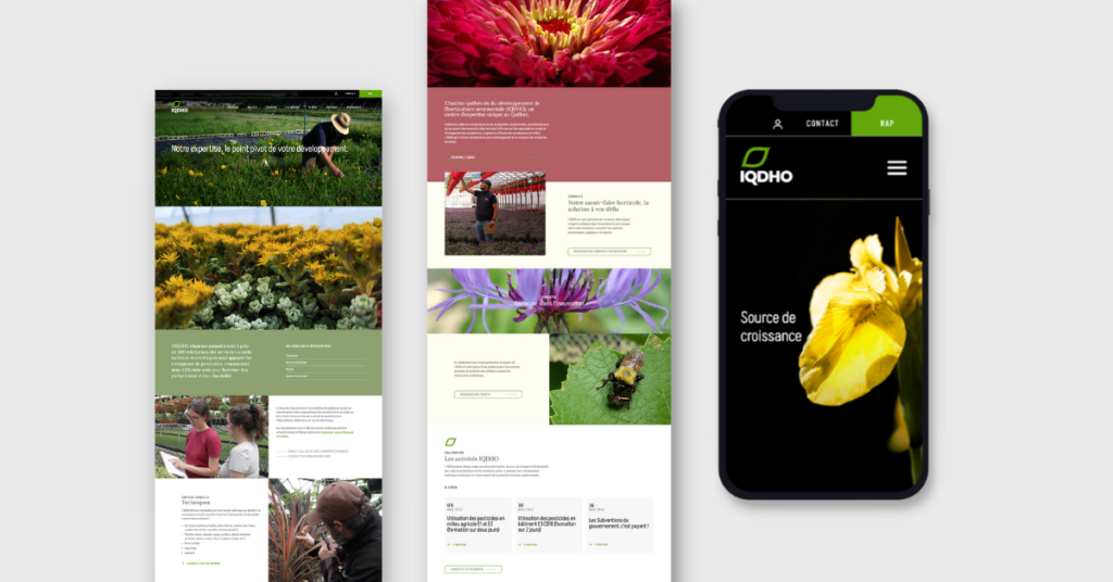
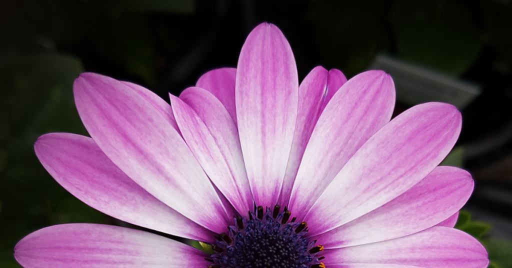
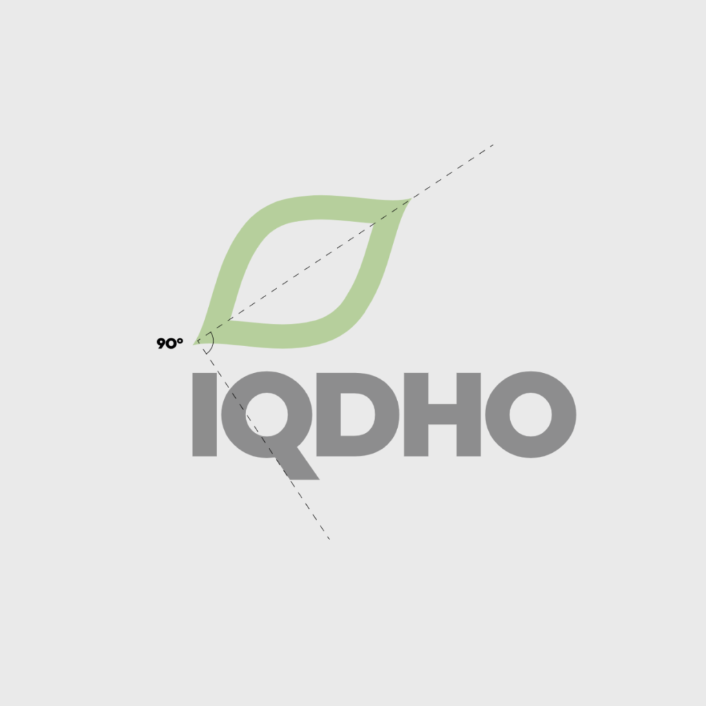
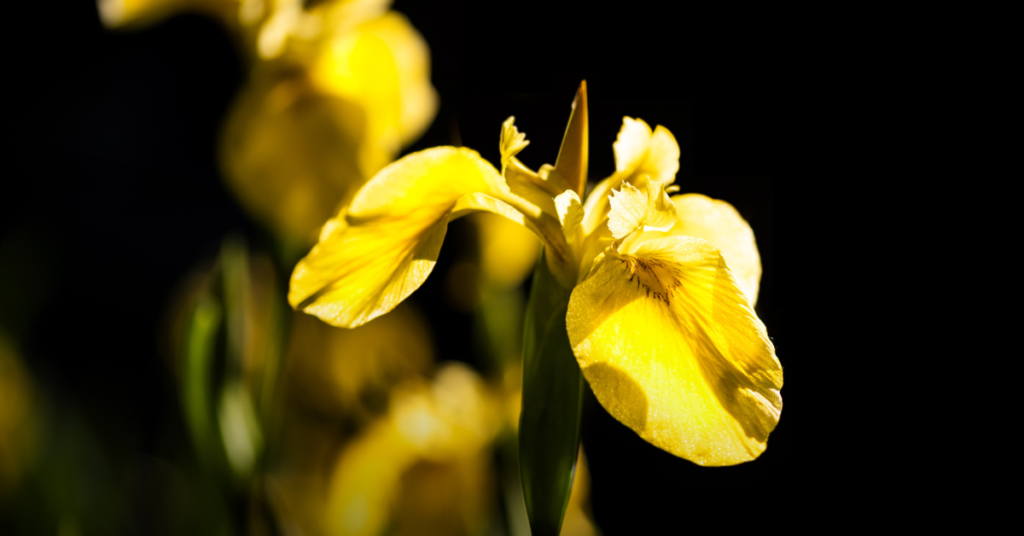
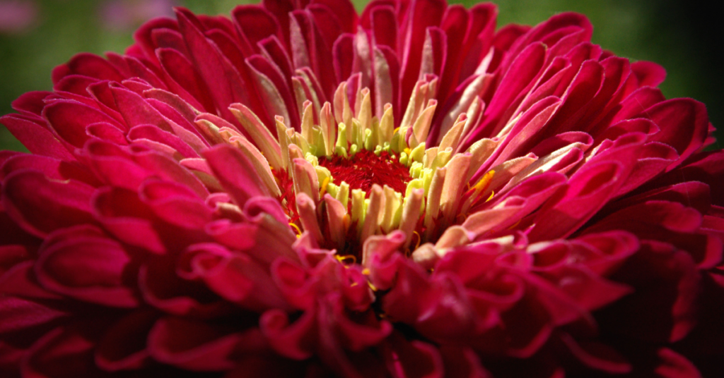
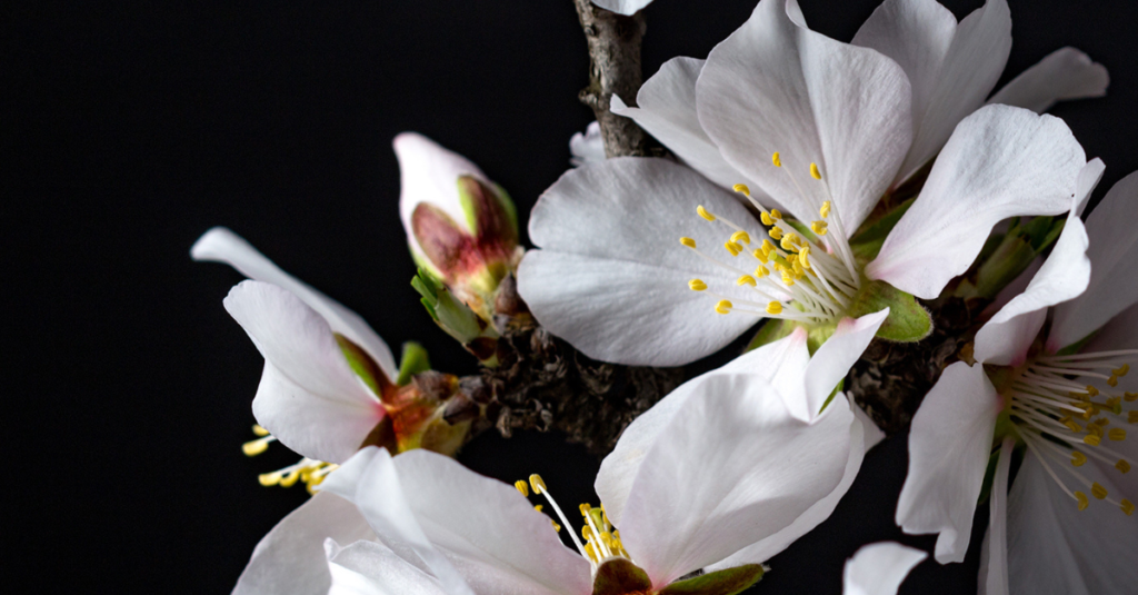
The imagery associated with ornamental horticulture is naturally appealing, with bright colours, lush plants and repetitive patterns created by greenhouse displays or furrows in a field. Visually, IQDHO had not yet made the most of this opportunity. The Larouche team took the rich existing photo content and built distinctive imagery of the ornamental horticulture landscape around it. The challenge was to redesign the visual identity to keep it simple and preserve the company’s legacy while making it resonate with today’s world. The masterful result was a new, simplified logo and bold, high-contrast imagery, going from deep black to a series of vibrant colour accents that pay tribute to the diversity of nature.
he project ultimately came to life in the newly designed website. The more streamlined and user-friendly new platform presents the services available in a structured way and emphasizes things that were hidden in the previous version. There is a focus on horticultural know-how, the advisors’ down-to-earth approach and research, which is central to IQDHO’s innovation mission. Functional additions such as a shop section, a member section and a member account portal were also thoughtfully integrated to make the experience more efficient.
Overall, the visual and digital update helps cement IQDHO’s promise to act as a catalyst for the development and growth of local businesses by constantly staying one step ahead of new technologies, methods and solutions to future challenges.
See the complete portfolio here.